Work examples
New strategy and a new product
Zmarta |UX Strategist & Designer | 2019
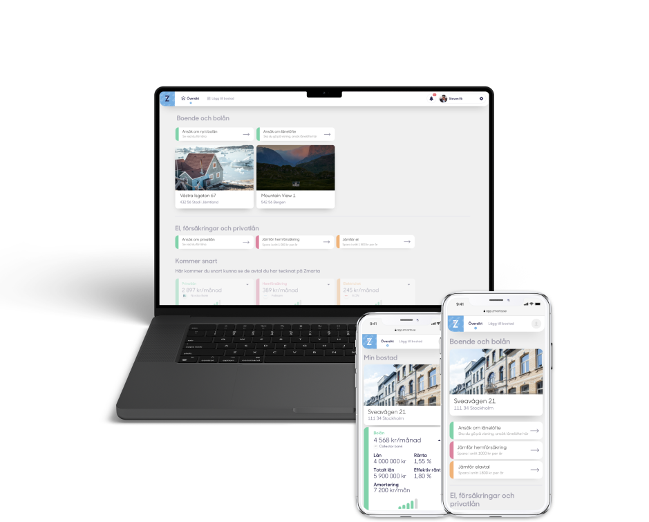
Zmarta were going through a strong business development period from supporting person loans and tele-sales only to become a multi-vertical tech company with more sales happening online. I joined the team that led this change and worked with creating concepts and UX design to illustrate the new vision and strategy, but also creating the experience for the new products.
One of the bigger initiatives at Zmarta was to create a new mortgage product from a blank paper. The work was carried out in a team of business developers, system developers and a UI designer. We worked close with banks and internal agents who both were part of the customer journey. The work was carried out in a Lean Startup / agile way with delivery in steps and continuous learning from feedback.
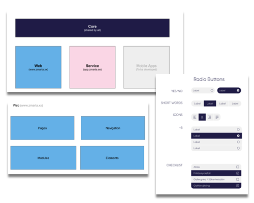
My role was to create UX design for the various users and also to catch needs and insights from user testing, data analytics and feedback from customers, partners and customer service. Together with the UI designer I initiated and created a design system to be shared across all product verticals as a foundation for the unified multi-product strategy.
It was very fun to see the new vision take shape as the work progressed rapidly.
A startup in a fast growth phase
Insurello | UX Lead | 2022
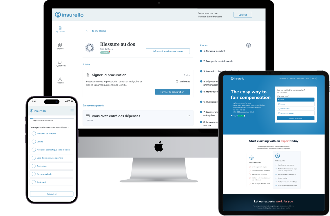
I joined Insurello at an exciting time of company growth. New investment rounds led to a rapid growth of people and new exciting product development. I was working as the UX lead and worked with a UI Designer across muliple product teams and with the marketing/growth team.
We created design for new product initiatives, new verticals and new markets in parallel to building the Insurello design system from scratch as a product of its own. It was hectic, but very fun
New product package
Projectplace |Product Manager | 2014
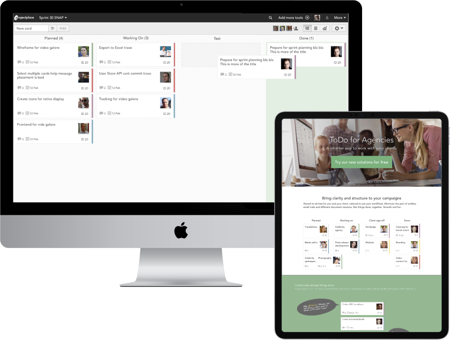
As Product Manager of this initiative I headed up a team of developers and designers. We created the new package including a fresh new sign-up experience and web sites targeted to different verticals. We launched the solution to the market in steps, including a public beta version from which we collected feedback continously.
New visual identity
Projectplace | Head of UX | 2014
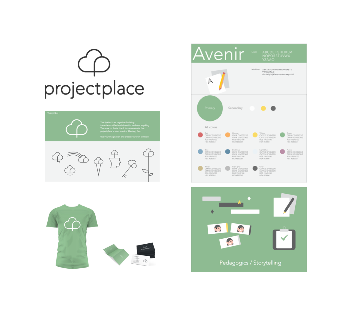
I initiated and gathered a group of passionate designers from across the company who wanted to create a consistent identity across all touch points. I set the vision and pushed the creative process forward through a series of workshops. The designers did all the work on their free time and when we presented the result to the management team they were blown away by what we had achieved. The new identity was introduced in 2014 covering all digital and print channels such as product, web site, videos, stationary and merchandise.
UX in a Growth team
Projectplace | UX Designer | 2016
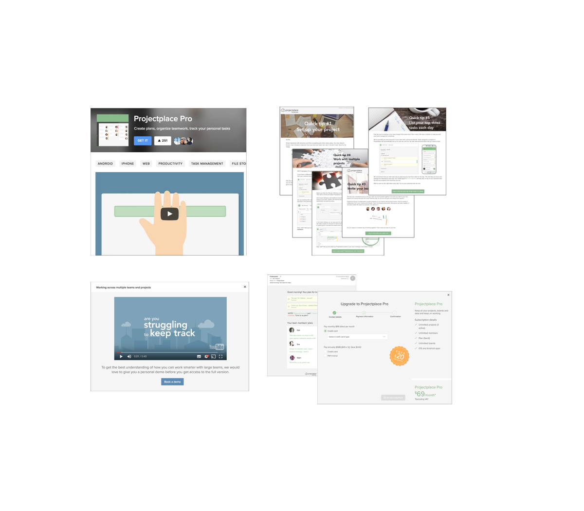
With the goal to drive growth and increase the conversion of our online sales offering we formed a growth team. The goals where to build an experience that would get as many new users as possible to the magic moment – the moment where they really understand the unique values of our solution and how it would help them with their needs.
We had continuous feedback loop from our customers and turned their feedback to insights and did a number of experiments and A/B tests to improve the experience. Our primary focus was on acquiring users and to activate the users in the service but we tracked the numbers across the the whole funnel to maximise growth – from marketing to paying customer.
Design system for digital products
Zmarta | UX Strategist & Designer | 2019
In order to create a consistent user experience of your product – you need to address the design work systematically. If you design the user flows one by one or have multiple teams building your product – you will most likely end up with designs that with different kind of UIs, flows and language – creating a fragmented, more difficult user experience. Moreover, as a user, you cannot feel that it is the same product, service or company.
In order to create a true world class experience you need to work and build a design system. This includes all parts of your UI – from colors, spacing, type, controls , flows, pages and language. With a system at hand, teams can build one and the same experience even though they work in parallel or build new features over time.
The work typically includes a lot of work by designers and developers and the result is both a system of design elements for the designers and re-usable code components for the developers. Moreover, when everyone in the product development is using the design system significant efficiency gains can be achieved.
I have worked with building design systems in all my projects the past 10 years. It is hard work, but the end result always makes me smile.
UX Guidelines
Projectplace | Head of UX | 2014
As your product organsiation and company grows bigger it can be really hard to make all people and teams create a unified experience together. It might be different people who e.g. write UX copy or create the designs for different parts of your product and market communication. Still, you want the user to feel that it is one and the same system, that signals the type of experience your company stands for. How can you achieve this in a organisation with many teams, spread out in the world?
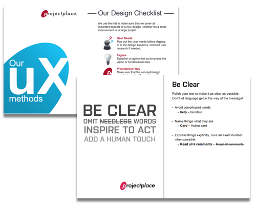
In my role as Manager of the UX team I introduced a set of guidelines to support a consistent UX across the product UIs and communcation. We created these together in the team, and then packaged it in a scannable and easy-to-use folder format with examples and do’s and dont’s. This help all product teams and the whole organisation to create a more consistent experience across all communication platforms.
Sharing insights and user research
TUI | UX Strategist & Designer |2019
User and market research is often the first thing you do before sketching on UX design. However, user insights can be difficult to share and can be forgotten as you get back to your daily product development tasks. So how do you translate the research findings into something that can be shared across your team and make the most out of your user research?
There are a number of tools to achieve insight sharing. I have used the below tools and many more over the years and find them very useful.
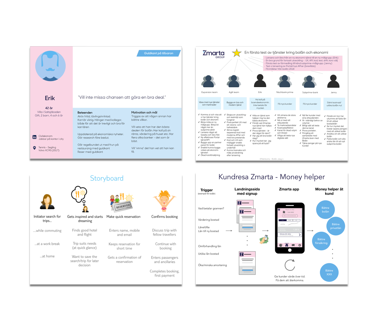
Personas – fictional people from your target groups – can be created to bring user needs and behaviours into your design meetings and discussions.
Impact maps – is a way of structuring the work with business goals, user needs, behaviours and how you can support these with your product. This can be very useful as a tool in a cross-functional product team and with business owners.
Storyboards are powerful for communicating user scenarios of your product such as a user is about to perform a task with your service or product.
A customer journey is a way to show each step and interaction a user has with your service or product today. It can make it clear to everyone how you support the user needs with your experience and where there are gaps in todays experience. It can also be used to pinpoint the areas you want to focus on improving in your next iteration of your product.